Installation
Install Qwik UI with your choice of package manager below:
Meta-framework guides
Building Blocks
Each component includes a building blocks section, which provides a barebones example of the component. This can be used as a starting point for implementing the component from scratch.
Below is an example of the Accordion component's building block:
import { component$ } from '@builder.io/qwik';
import { Accordion } from '@qwik-ui/headless';

export default component$(() => {
  return (
    <Accordion.Root>
      <Accordion.Item>
        <Accordion.Header>
          <Accordion.Trigger>Title</Accordion.Trigger>
        </Accordion.Header>
        <Accordion.Content>Content</Accordion.Content>
      </Accordion.Item>
    </Accordion.Root>
  );
});
We will use this example as a Qwik UI component in each guide.
Qwik City
To create a Qwik city app, run the following command:
Let's select the empty app option in the CLI to keep it simple. And remember, choosing the dad joke is not optional - it's mandatory! We have a highly sophisticated Dad Joke Detection System (DJDS) in place, so we'll know if you didn't!
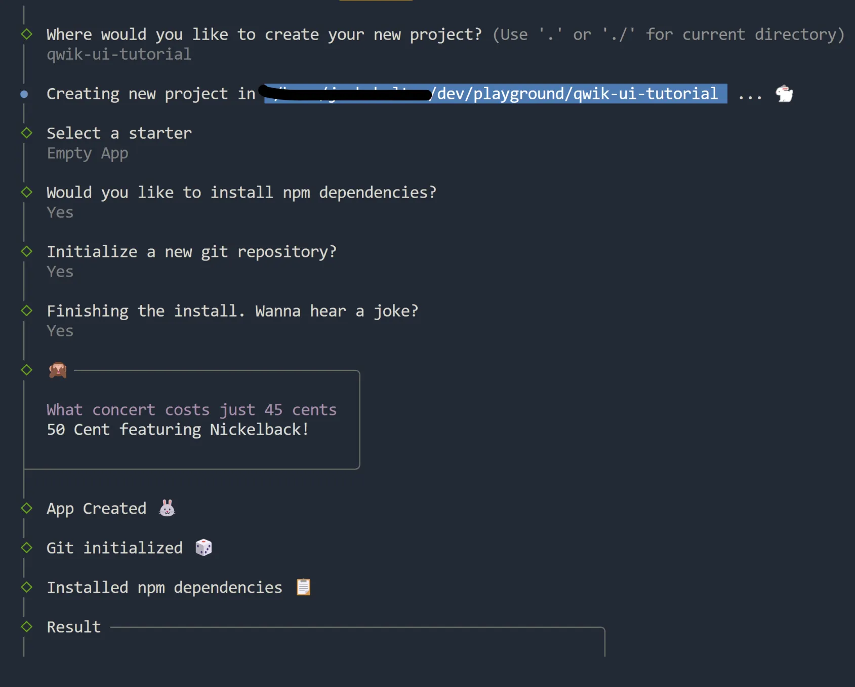
Below is the Qwik City project structure. Inside of the src directory, let's create a new folder called accordion. Then, a file named accordion.tsx inside of src/components.
Qwik City files ├─ .eslintignore ├─ .eslintrc.cjs ├─ .gitignore ├─ .prettierignore ├─ README.md ├─ package-lock.json ├─ package.json ├─ public │ ├─ favicon.svg │ ├─ manifest.json │ └─ robots.txt ├─ src │ ├─ components │ │ └─ accordion │ │ └─ accordion.tsx │ │ └─ router-head │ │ └─ router-head.tsx │ ├─ entry.dev.tsx │ ├─ entry.preview.tsx │ ├─ entry.ssr.tsx │ ├─ global.css │ ├─ root.tsx │ └─ routes │ ├─ index.tsx │ ├─ layout.tsx │ └─ service-worker.ts ├─ tsconfig.json └─ vite.config.ts
Now, to create a component, you can simply copy/paste the code from the building blocks section, or the snippet provided in the code tab below 👇
import { component$ } from '@builder.io/qwik';
import { Accordion } from '@qwik-ui/headless';

export default component$(() => {
  return (
    <Accordion.Root>
      <Accordion.Item>
        <Accordion.Header>
          <Accordion.Trigger>Click on me!</Accordion.Trigger>
        </Accordion.Header>
        <Accordion.Content>Content</Accordion.Content>
      </Accordion.Item>
    </Accordion.Root>
  );
});
Hooray! We've now added our first Qwik UI component in Qwik City. It includes a starting point where the accordion functionality and aria behavior is added for us.
Let's add a few styles to make the component stand out more, we'll use Tailwind CSS as a styling solution.
Admiral Turbo Meowington
Edger Allen Paw
Captain Sushi
Fernsbane The Inquisitive
import { PropsOf, component$ } from '@builder.io/qwik';
import { Accordion } from '@qwik-ui/headless';

export default component$(() => {
  const cats = [
    'Admiral Turbo Meowington',
    'Edger Allen Paw',
    'Captain Sushi',
    'Fernsbane The Inquisitive',
  ];

  return (
    <Accordion.Root class="rounded-base box-border w-[250px] max-w-[500px] border border-slate-500 bg-slate-600 text-white">
      {cats.map((item, index) => (
        <Accordion.Item class="w-full" key={index}>
          <Accordion.Header as="h3">
            <Accordion.Trigger
              class={`group flex min-h-[44px] w-full items-center justify-between ${
                index === 0 ? 'rounded-t-sm' : ''
              } ${
                index === cats.length - 1 ? 'rounded-b-sm border-b-0' : 'border-b'
              } border-slate-500 bg-slate-600 px-4 py-2 text-left hover:bg-slate-700`}
            >
              <span>favorite cat {index + 1}</span>
              <span class="pl-2">
                <SVG class="ease transition-transform duration-500 group-aria-expanded:rotate-180 group-aria-expanded:transform" />
              </span>
            </Accordion.Trigger>
          </Accordion.Header>
          <Accordion.Content class="accordion-animation-1 overflow-hidden">
            <p class="bg-slate-900 p-4">{item}</p>
          </Accordion.Content>
        </Accordion.Item>
      ))}
    </Accordion.Root>
  );
});

export function SVG(props: PropsOf<'svg'>) {
  return (
    <svg
      xmlns="http://www.w3.org/2000/svg"
      width="1em"
      height="1em"
      viewBox="0 0 1024 1024"
      {...props}
    >
      <path
        fill="currentColor"
        d="M831.872 340.864L512 652.672L192.128 340.864a30.592 30.592 0 0 0-42.752 0a29.12 29.12 0 0 0 0 41.6L489.664 714.24a32 32 0 0 0 44.672 0l340.288-331.712a29.12 29.12 0 0 0 0-41.728a30.592 30.592 0 0 0-42.752 0z"
      ></path>
    </svg>
  );
}
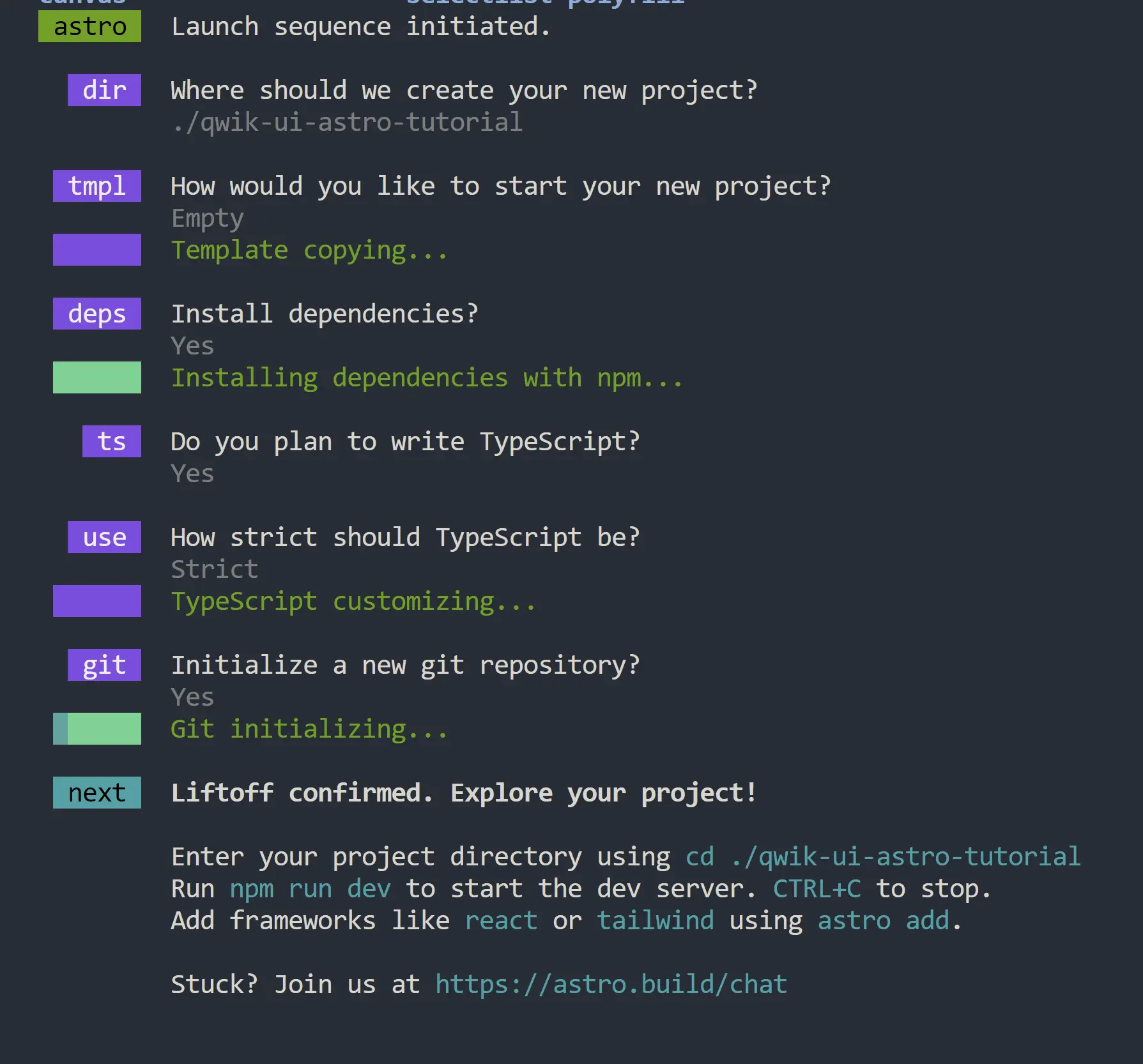
Astro
To set up an Astro application, add the following command in the terminal:
Add a relative path for your project, and select the empty option in the CLI.
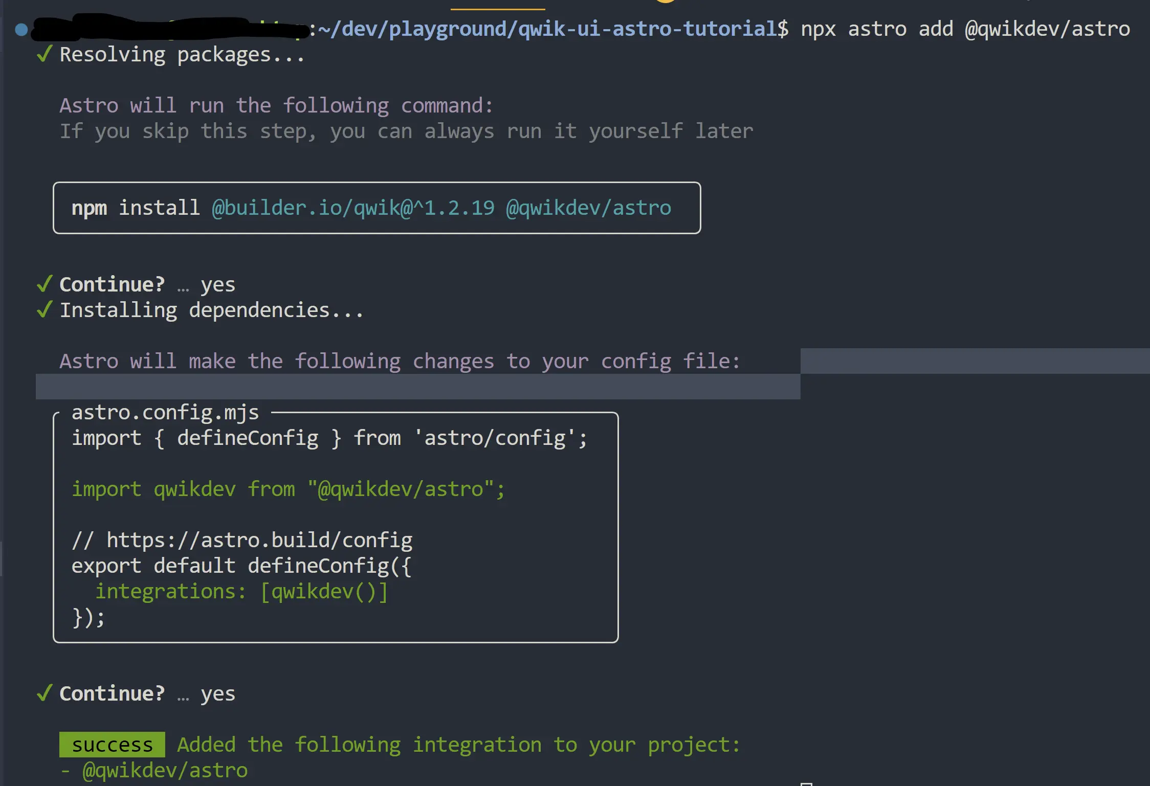
Next, let's add the @qwikdev/astro integration. This integration allows us to leverage resumability and Qwik components inside of Astro.
Run the following command in the terminal:
Then, let's make sure we use Qwik as our main jsxImportSource in tsconfig.json. Otherwise, it will not get the proper Qwik types.
{
    "extends": "astro/tsconfigs/strict",
    "compilerOptions": {
        "jsx": "react-jsx",
        "jsxImportSource": "@builder.io/qwik"
    }
}
Under the src directory, let's create a folder called components. Similar to the Qwik City guide, we'll create a folder named accordion, and a file named accordion.tsx.
Below is the project structure with this in place.
Astro files ├─ .gitignore ├─ README.md ├─ astro.config.mjs ├─ package-lock.json ├─ package.json ├─ public │ └─ favicon.svg ├─ src │ ├─ env.d.ts │ └─ pages │ ├─ components │ │ └─ accordion │ │ └─ accordion.tsx │ └─ index.astro └─ tsconfig.json
Once again, let's copy our building-blocks example from above.
import { component$ } from '@builder.io/qwik';
import { Accordion } from '@qwik-ui/headless';

export default component$(() => {
  return (
    <Accordion.Root>
      <Accordion.Item>
        <Accordion.Header>
          <Accordion.Trigger>Title</Accordion.Trigger>
        </Accordion.Header>
        <Accordion.Content>Content</Accordion.Content>
      </Accordion.Item>
    </Accordion.Root>
  );
});
import { component$ } from '@builder.io/qwik';
import { Accordion } from '@qwik-ui/headless';

export default component$(() => {
  return (
    <Accordion.Root>
      <Accordion.Item>
        <Accordion.Header>
          <Accordion.Trigger>Click on me!</Accordion.Trigger>
        </Accordion.Header>
        <Accordion.Content>Content</Accordion.Content>
      </Accordion.Item>
    </Accordion.Root>
  );
});
And we'll spice it up a bit using some vanilla CSS.
Tom's bookshelf
import { PropsOf, component$, useStyles$ } from '@builder.io/qwik';
import { Accordion } from '@qwik-ui/headless';

export default component$(() => {
  const dogs = ['Othello', 'The Hobbit', 'Dune', 'The Giver'];

  useStyles$(`
    .accordion-root {
        box-sizing: border-box;
        border-radius: 0.275rem;
        color: #ffffff;
        width: 250px;
        max-width: 500px;
        border: 1px solid #4B5563;
        background-color: #4B5563;
    }

    .accordion-trigger {
        display: flex;
        min-height: 44px;
        width: 100%;
        align-items: center;
        justify-content: space-between;
        padding: 0.5rem 1rem;
        text-align: left;
        border-bottom: 1px solid #374151;
        background-color: #4B5563;
        transition: background-color 200ms ease;
    }

    .accordion-trigger:hover {
        background-color: #374151;
      }

      .accordion-trigger.rounded-t-sm {
        border-top-left-radius: 0.125rem;
        border-top-right-radius: 0.125rem;
      }

      .accordion-trigger.rounded-b-sm {
        border-bottom-left-radius: 0.125rem;
        border-bottom-right-radius: 0.125rem;
      }

      .accordion-trigger.border-b-0 {
        border-bottom: 0;
      }

      .accordion-trigger[aria-expanded="true"] {
        border-radius: 0;
      }

      .accordion-trigger svg {
        transition: transform 500ms ease;
      }

      .accordion-trigger[aria-expanded="true"] svg {
        transform: rotateX(180deg);
      }

      .accordion-content {
        overflow: hidden;
        background-color: #1F2937;
      }

      .accordion-slide[data-open] {
        animation: 500ms cubic-bezier(0.87, 0, 0.13, 1) 0s 1 normal forwards accordion-open;
      }

      .accordion-slide[data-closed] {
        animation: 500ms cubic-bezier(0.87, 0, 0.13, 1) 0s 1 normal forwards accordion-close;
      }

      .accordion-content p {
        background: #1F2937;
        padding: 0.5rem 1rem;
      }

      .accordion-item:last-of-type .accordion-content {
        border-bottom-left-radius: 0.275rem;
        border-bottom-right-radius: 0.275rem;
      }

      .tom-headline {
        margin-bottom: 16px;
        font-weight: 600;
      }
  `);

  return (
    <>
      <h2 class="tom-headline">Tom's bookshelf</h2>
      <Accordion.Root class="accordion-root">
        {dogs.map((item, index) => (
          <Accordion.Item class="accordion-item" key={index}>
            <Accordion.Header as="h3">
              <Accordion.Trigger
                class={`accordion-trigger group ${index === 0 ? 'rounded-t-sm' : ''} ${
                  index === dogs.length - 1 ? 'rounded-b-sm border-b-0' : ''
                }`}
              >
                <span>favorite book {index + 1}</span>
                <span style={{ paddingLeft: '8px' }}>
                  <SVG />
                </span>
              </Accordion.Trigger>
            </Accordion.Header>
            <Accordion.Content class="accordion-slide accordion-content">
              <p>{item}</p>
            </Accordion.Content>
          </Accordion.Item>
        ))}
      </Accordion.Root>
    </>
  );
});

export function SVG(props: PropsOf<'svg'>) {
  return (
    <svg
      xmlns="http://www.w3.org/2000/svg"
      width="1em"
      height="1em"
      viewBox="0 0 1024 1024"
      {...props}
    >
      <path
        fill="currentColor"
        d="M831.872 340.864L512 652.672L192.128 340.864a30.592 30.592 0 0 0-42.752 0a29.12 29.12 0 0 0 0 41.6L489.664 714.24a32 32 0 0 0 44.672 0l340.288-331.712a29.12 29.12 0 0 0 0-41.728a30.592 30.592 0 0 0-42.752 0z"
      ></path>
    </svg>
  );
}