Modal
A panel that appears above all other content, blocking interaction with the rest of the page.
import { component$, useStyles$ } from '@builder.io/qwik';
import { Modal, Label } from '@qwik-ui/headless';

export default component$(() => {
  useStyles$(styles);

  return (
    <Modal.Root>
      <Modal.Trigger class="modal-trigger">Open Modal</Modal.Trigger>
      <Modal.Panel class="modal-panel">
        <Modal.Title>Edit Profile</Modal.Title>
        <Modal.Description>
          You can update your profile here. Hit the save button when finished.
        </Modal.Description>
        <Label>
          Name
          <input type="text" placeholder="John Doe" />
        </Label>
        <Label>
          Email
          <input type="text" placeholder="johndoe@gmail.com" />
        </Label>
        <footer>
          <Modal.Close class="modal-close">Cancel</Modal.Close>
          <Modal.Close class="modal-close">Save Changes</Modal.Close>
        </footer>
      </Modal.Panel>
    </Modal.Root>
  );
});

// internal
import styles from '../snippets/modal.css?inline';
✨ Features
- Follows WAI-ARIA dialog and alertdialog guidelines.
- Screen reader support with title and description.
- Full keyboard navigation
- Locks focus inside the modal
- Prevents scrolling when open
- Control the open state
- Above other content
- Custom backdrop dismiss
Building Blocks
import { component$ } from '@builder.io/qwik';
import { Modal } from '@qwik-ui/headless';

export default component$(() => {
  return (
    <Modal.Root>
      <Modal.Trigger>Open Modal</Modal.Trigger>
      <Modal.Panel>
        <Modal.Title>Accessible Name</Modal.Title>
        <Modal.Description>Optional Description</Modal.Description>
        {/* other content */}
      </Modal.Panel>
    </Modal.Root>
  );
});
🎨 Anatomy
| Component | Description |
Modal.Root | The primary container for the modal. |
Modal.Panel | The dialog element that is rendered on top of other content. |
Modal.Trigger | A button that opens the modal when interacted with. |
Modal.Title | An accessible name for the modal. |
ModalDescription | An optional accessible description for the modal. |
Modal.Close | A button that closes the modal when interacted with. |
Why use a headless modal?
Modals are used when an important choice needs to be made in the application. The rest of the content isn't interactive until a certain action has been performed.
Qwik UI builds on top of the dialog element, and solves the following issues:
Native dialog pain points
- Unintuitive focus locking behavior
- No scroll locking behavior
- Unintuitive user agent styles
- Confusing terminology (non-modal dialogs)
Dialog extendability
import { component$, useStyles$ } from '@builder.io/qwik';
import { Modal, Label } from '@qwik-ui/headless';

export default component$(() => {
  useStyles$(styles);

  return (
    <Modal.Root>
      <Modal.Trigger class="modal-trigger">Open Modal</Modal.Trigger>
      <Modal.Panel class="modal-panel">
        <Modal.Title>Edit Profile</Modal.Title>
        <Modal.Description>
          You can update your profile here. Hit the save button when finished.
        </Modal.Description>
        <Label>
          Name
          <input type="text" placeholder="John Doe" />
        </Label>
        <Label>
          Email
          <input type="text" placeholder="johndoe@gmail.com" />
        </Label>
        <footer>
          <Modal.Close class="modal-close">Cancel</Modal.Close>
          <Modal.Close class="modal-close">Save Changes</Modal.Close>
        </footer>
      </Modal.Panel>
    </Modal.Root>
  );
});

// internal
import styles from '../snippets/modal.css?inline';
Above, we mentioned the Modal component uses the dialog element. This means you can also use the native dialog element attributes to customize the modal.
Attribute example
import { component$, useStyles$ } from '@builder.io/qwik';
import { Modal, Label } from '@qwik-ui/headless';
import styles from '../snippets/modal.css?inline';

export default component$(() => {
  useStyles$(styles);

  return (
    <Modal.Root>
      <Modal.Trigger class="modal-trigger">Open Modal</Modal.Trigger>
      <Modal.Panel class="modal-panel">
        <Modal.Title>Edit Profile</Modal.Title>
        <Modal.Description>
          You can update your profile here. Hit the save button when finished.
        </Modal.Description>
        <Label>
          Name
          <input type="text" placeholder="John Doe" />
        </Label>
        <Label>
          Email
          <input autofocus type="text" placeholder="johndoe@gmail.com" />
        </Label>
        <footer>
          <Modal.Close class="modal-close">Cancel</Modal.Close>
          <Modal.Close class="modal-close">Save Changes</Modal.Close>
        </footer>
      </Modal.Panel>
    </Modal.Root>
  );
});
Above is an example of the autofocus attribute, used to focus the 2nd input when the dialog is opened.
Programmatic behavior
To programmatically open or close the modal, we can use bind:show, a signal prop that allows us to reactively control the modal state.
import { component$, useSignal, useStyles$ } from '@builder.io/qwik';
import { Modal, Label } from '@qwik-ui/headless';

export default component$(() => {
  useStyles$(styles);
  const isOpen = useSignal(false);

  return (
    <>
      <button onClick$={() => (isOpen.value = true)} class="modal-trigger">
        Programmatically open modal
      </button>
      <Modal.Root bind:show={isOpen}>
        <Modal.Panel class="modal-panel">
          <Modal.Title>Edit Profile</Modal.Title>
          <Modal.Description>
            You can update your profile here. Hit the save button when finished.
          </Modal.Description>
          <Label>
            Name
            <input type="text" placeholder="John Doe" />
          </Label>
          <Label>
            Email
            <input type="text" placeholder="johndoe@gmail.com" />
          </Label>
          <footer>
            <Modal.Close class="modal-close">Cancel</Modal.Close>
            <Modal.Close class="modal-close">Save Changes</Modal.Close>
          </footer>
        </Modal.Panel>
      </Modal.Root>
    </>
  );
});

// internal
import styles from '../snippets/modal.css?inline';
isOpen is a signal that we pass into our Modal component to customize when the modal can be open or closed.
The Top Layer
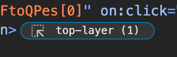
In Chrome and Edge, a top layer UI button is shown in the dev tools. This means the element content is placed above any other content on the page, preventing any overflow or style issues.
The top layer is used in both the Modal and Popover components of Qwik UI.
Backdrops
To add a backdrop, the ::backdrop pseudo element can be used. Backdrops are right underneath top layer elements.
By default, the dialog element comes with a subtle backdrop, below is a snippet customizing the backdrop background along with the backdrop filter css property.
.modal-backdrop::backdrop {
  /* changing background */
  background: rgba(0, 0, 0, 0.4);

  /* providing multiple filters */
  backdrop-filter: grayscale(90%) blur(10px);
}
import { component$, useStyles$ } from '@builder.io/qwik';
import { Modal, Label } from '@qwik-ui/headless';
import styles from '../snippets/modal.css?inline';

export default component$(() => {
  useStyles$(styles);

  return (
    <Modal.Root>
      <Modal.Trigger class="modal-trigger">Open Modal</Modal.Trigger>
      <Modal.Panel class="modal-panel modal-backdrop">
        <Modal.Title>Edit Profile</Modal.Title>
        <Modal.Description>
          You can update your profile here. Hit the save button when finished.
        </Modal.Description>
        <Label>
          Name
          <input type="text" placeholder="John Doe" />
        </Label>
        <Label>
          Email
          <input type="text" placeholder="johndoe@gmail.com" />
        </Label>
        <footer>
          <Modal.Close class="modal-close">Cancel</Modal.Close>
          <Modal.Close class="modal-close">Save Changes</Modal.Close>
        </footer>
      </Modal.Panel>
    </Modal.Root>
  );
});
Dismissing Modals via Backdrop
import { component$, useStyles$ } from '@builder.io/qwik';
import { Modal, Label } from '@qwik-ui/headless';
import styles from '../snippets/modal.css?inline';

export default component$(() => {
  useStyles$(styles);

  return (
    <Modal.Root closeOnBackdropClick={false}>
      <Modal.Trigger class="modal-trigger">Open Modal</Modal.Trigger>
      <Modal.Panel class="modal-panel">
        <Modal.Title>Edit Profile</Modal.Title>
        <Modal.Description>
          You can update your profile here. Hit the save button when finished.
        </Modal.Description>
        <Label>
          Name
          <input type="text" placeholder="John Doe" />
        </Label>
        <Label>
          Email
          <input type="text" placeholder="johndoe@gmail.com" />
        </Label>
        <footer>
          <Modal.Close class="modal-close">Cancel</Modal.Close>
          <Modal.Close class="modal-close">Save Changes</Modal.Close>
        </footer>
      </Modal.Panel>
    </Modal.Root>
  );
});
By default, modals are dismissed when clicking the backdrop. To disable this behavior, set disableOnBackdropClick={true} on the <Modal.Root /> component.
Alertdialog
An alert dialog is a modal that interrupts user workflow to convey critical information and obtain a response. It's typically used for confirmations, error messages, or destructive actions.
import { component$ } from '@builder.io/qwik';
import { Modal } from '@qwik-ui/headless';

export default component$(() => {
  return (
    <Modal.Root alert>
      <Modal.Trigger class="modal-trigger">Deactivate</Modal.Trigger>
      <Modal.Panel class="modal-panel">
        <Modal.Title>Deactive Account</Modal.Title>
        <Modal.Description>
          Are you sure you want to deactivate your account?
        </Modal.Description>
        <footer>
          <Modal.Close class="modal-close">Cancel</Modal.Close>
          <Modal.Close class="modal-close">Delete</Modal.Close>
        </footer>
        <Modal.Close class="modal-alert-close">+</Modal.Close>
      </Modal.Panel>
    </Modal.Root>
  );
});
By adding the alert prop to our component, we adhere to the WAI ARIA Alertdialog specification, enabling assistive technologies to distinguish alert dialogs for special handling.
Alertdialogs cannot be dismissed by clicking the backdrop, regardless of whether the disableOnBackdropClick prop was set to true.
Focus Locking
Focus locking prevents focus from leaving the modal.
import { component$, useStyles$ } from '@builder.io/qwik';
import { Modal, Label } from '@qwik-ui/headless';

export default component$(() => {
  useStyles$(styles);

  return (
    <Modal.Root>
      <Modal.Trigger class="modal-trigger">Open Modal</Modal.Trigger>
      <Modal.Panel class="modal-panel">
        <Modal.Title>Edit Profile</Modal.Title>
        <Modal.Description>
          You can update your profile here. Hit the save button when finished.
        </Modal.Description>
        <Label>
          Name
          <input type="text" placeholder="John Doe" />
        </Label>
        <Label>
          Email
          <input type="text" placeholder="johndoe@gmail.com" />
        </Label>
        <footer>
          <Modal.Close class="modal-close">Cancel</Modal.Close>
          <Modal.Close class="modal-close">Save Changes</Modal.Close>
        </footer>
      </Modal.Panel>
    </Modal.Root>
  );
});

// internal
import styles from '../snippets/modal.css?inline';
Using the Tab key to navigate through the modal will cycle the focus from the last to the first focusable element automatically.
Stripped Styles
As a headless library, Qwik UI avoids adding styles to components. However, it uses native solutions where appropriate, which may include browser default styles.
These default styles can be difficult to manage, so they have been removed from the Modal component to simplify debugging.
@layer qwik-ui {
  /* browsers automatically set an interesting max-width and max-height for dialogs
      https://twitter.com/t3dotgg/status/1774350919133691936
  */
  dialog:modal {
    max-width: unset;
    max-height: unset;
  }
}
While in most cases, this would be up to a consumer's CSS reset to solve, in this case we are stripping the max-width and max-height styles on the dialog element under the hood.
This is done in a separate layer so that styles are easily overridable in consumer facing applications.
Animations
Modals require smooth entry and exit animations to enhance user experience. However, animating properties like display and overlay can be challenging because they are discrete properties and not traditionally animatable.
Modern browsers have introduced discrete animation capabilities, allowing us to animate these properties effectively. Below, we'll explore how to implement animations and transitions for modals using keyframe animations and CSS transitions.
Keyframe Animation Example
Keyframes are ideal for handling the entry and exit of the modal. Here's an example using modalOpen for opening and modalClose for closing the modal:
import { component$, useStyles$ } from '@builder.io/qwik';
import { Modal, Label } from '@qwik-ui/headless';

export default component$(() => {
  useStyles$(`
    .modal-animation {
      animation: modalClose 0.35s ease-in-out forwards;
    }

    .modal-animation:popover-open {
      animation: modalOpen 0.75s ease-in-out forwards;
    }

    @keyframes modalOpen {
      from {
        opacity: 0;
        transform: scale(0.9);
      }
      to {
        opacity: 1;
        transform: scale(1);
      }
    }

    @keyframes modalClose {
      from {
        opacity: 1;
        transform: scale(1);
      }
      to {
        opacity: 0;
        transform: scale(0.9);
      }
    }`);

  return (
    <Modal.Root>
      <Modal.Trigger class="modal-trigger">Open Modal</Modal.Trigger>
      <Modal.Panel class="modal-panel modal-animation">
        <Modal.Title>Edit Profile</Modal.Title>
        <Modal.Description>
          You can update your profile here. Hit the save button when finished.
        </Modal.Description>
        <Label>
          Name
          <input type="text" placeholder="John Doe" />
        </Label>
        <Label>
          Email
          <input type="text" placeholder="johndoe@gmail.com" />
        </Label>
        <footer>
          <Modal.Close class="modal-close">Cancel</Modal.Close>
          <Modal.Close class="modal-close">Save Changes</Modal.Close>
        </footer>
      </Modal.Panel>
    </Modal.Root>
  );
});
Transition Declarations
Transitions are useful for animating properties like opacity and transform. Here's how to implement transitions for the modal:
import { component$, useStyles$ } from '@builder.io/qwik';
import { Modal, Label } from '@qwik-ui/headless';

export default component$(() => {
  useStyles$(`
    .modal-transition {
      opacity: 0;
      transform: scale(0.9);
      transition:
        opacity 0.35s ease-in-out,
        transform 0.35s ease-in-out,
        display 0.35s,
        overlay 0.35s;
      transition-behavior: allow-discrete;
    }

    .modal-transition:popover-open {
      opacity: 1;
      transform: scale(1);
    }

    @starting-style {
      .modal-transition:popover-open {
        opacity: 0;
        transform: scale(0.9);
      }
    }`);

  return (
    <Modal.Root>
      <Modal.Trigger class="modal-trigger">Open Modal</Modal.Trigger>
      <Modal.Panel class="modal-panel modal-transition">
        <Modal.Title>Edit Profile</Modal.Title>
        <Modal.Description>
          You can update your profile here. Hit the save button when finished.
        </Modal.Description>
        <Label>
          Name
          <input type="text" placeholder="John Doe" />
        </Label>
        <Label>
          Email
          <input type="text" placeholder="johndoe@gmail.com" />
        </Label>
        <footer>
          <Modal.Close class="modal-close">Cancel</Modal.Close>
          <Modal.Close class="modal-close">Save Changes</Modal.Close>
        </footer>
      </Modal.Panel>
    </Modal.Root>
  );
});
Backdrop animations
To animate the modal's backdrop, use the ::backdrop pseudo-element and include it in your keyframes or transitions:
import { component$, useStyles$ } from '@builder.io/qwik';
import { Modal, Label } from '@qwik-ui/headless';

export default component$(() => {
  useStyles$(`
    .modal-animation[open]::backdrop {
      animation: backdropFadeIn 0.75s ease-in-out forwards;
    }

    @keyframes backdropFadeIn {
      from {
        background-color: rgba(0, 0, 0, 0);
      }
      to {
        background-color: rgba(0, 0, 0, 0.65);
      }
    }`);

  return (
    <Modal.Root>
      <Modal.Trigger class="modal-trigger">Open Modal</Modal.Trigger>
      <Modal.Panel class="modal-panel modal-animation">
        <Modal.Title>Edit Profile</Modal.Title>
        <Modal.Description>
          You can update your profile here. Hit the save button when finished.
        </Modal.Description>
        <Label>
          Name
          <input type="text" placeholder="John Doe" />
        </Label>
        <Label>
          Email
          <input type="text" placeholder="johndoe@gmail.com" />
        </Label>
        <footer>
          <Modal.Close class="modal-close">Cancel</Modal.Close>
          <Modal.Close class="modal-close">Save Changes</Modal.Close>
        </footer>
      </Modal.Panel>
    </Modal.Root>
  );
});
Sheets
Sheets are a type of modal/overlay used to provide temporary access to important information, while also being easily dismissible.
Side Sheet
import { component$, useStyles$ } from '@builder.io/qwik';
import { Modal, Label } from '@qwik-ui/headless';
import styles from '../snippets/animation.css?inline';

export default component$(() => {
  useStyles$(styles);

  return (
    <>
      <Modal.Root>
        <Modal.Trigger class="modal-trigger">Open Modal</Modal.Trigger>
        <Modal.Panel class="modal-panel sheet">
          <Modal.Title>Edit Profile</Modal.Title>
          <Modal.Description>
            You can update your profile here. Hit the save button when finished.
          </Modal.Description>
          <Label>
            Name
            <input type="text" placeholder="John Doe" />
          </Label>
          <Label>
            Email
            <input type="text" placeholder="johndoe@gmail.com" />
          </Label>
          <footer>
            <Modal.Close class="modal-close">Cancel</Modal.Close>
            <Modal.Close class="modal-close">Save Changes</Modal.Close>
          </footer>
        </Modal.Panel>
      </Modal.Root>
    </>
  );
});
Bottom Sheet
import { component$, useStyles$ } from '@builder.io/qwik';
import { Modal, Label } from '@qwik-ui/headless';
import styles from '../snippets/animation.css?inline';

export default component$(() => {
  useStyles$(styles);

  return (
    <Modal.Root>
      <Modal.Trigger class="modal-trigger">Open Modal</Modal.Trigger>
      <Modal.Panel class="modal-panel bottom-sheet">
        <Modal.Title>Edit Profile</Modal.Title>
        <Modal.Description>
          You can update your profile here. Hit the save button when finished.
        </Modal.Description>
        <Label>
          Name
          <input type="text" placeholder="John Doe" />
        </Label>
        <Label>
          Email
          <input type="text" placeholder="johndoe@gmail.com" />
        </Label>
        <footer>
          <Modal.Close class="modal-close">Cancel</Modal.Close>
          <Modal.Close class="modal-close">Save Changes</Modal.Close>
        </footer>
      </Modal.Panel>
    </Modal.Root>
  );
});
Bottom sheets are more prevalent in mobile applications, usually to simplify UI.
Animations / Transitions CSS
:root {
  --modal-animation: forwards cubic-bezier(0.6, 0.6, 0, 1);
}

@keyframes modalFadeIn {
  from {
    opacity: 0;
  }
  to {
    opacity: 1;
  }
}

@keyframes modalFadeOut {
  from {
    opacity: 1;
  }
  to {
    opacity: 0;
  }
}

.modal-animation::backdrop,
.modal-panel.sheet::backdrop,
.modal-panel.bottom-sheet::backdrop {
  animation: modalFadeIn 0.75s var(--modal-animation);
}

.modal-animation[data-closing]::backdrop,
.modal-panel.sheet[data-closing]::backdrop,
.modal-panel.bottom-sheet[data-closing]::backdrop {
  animation: modalFadeOut 0.35s var(--modal-animation);
}

.modal-animation::backdrop {
  background: oklch(from 0, 0%, 0%, 0.5);
}

@keyframes modalOpen {
  from {
    opacity: 0;
    transform: scale(150%);
  }
  to {
    opacity: 1;
    transform: scale(100%);
  }
}

@keyframes modalClose {
  from {
    opacity: 1;
    transform: translateY(0%);
  }
  to {
    opacity: 0;
    transform: translateY(-200%);
  }
}

.modal-animation {
  animation: modalOpen 0.75s var(--modal-animation);
}

.modal-animation[data-closing] {
  animation: modalClose 0.35s var(--modal-animation);
}

@keyframes sheetOpen {
  from {
    opacity: 0;
    transform: translateX(100%);
  }
  to {
    opacity: 1;
    transform: translateX(0%);
  }
}

@keyframes sheetClose {
  from {
    opacity: 1;
    transform: translateX(0%);
  }
  to {
    opacity: 0;
    transform: translateX(100%);
  }
}

.modal-panel.sheet::backdrop {
  background: oklch(from 0, 0%, 0%, 0.5);
}

.modal-panel.sheet {
  right: 0;
  margin-right: 0;
  height: 100vh;
  animation: sheetOpen 0.75s var(--modal-animation);
  margin-left: auto;
}

.modal-panel.sheet[data-closing] {
  animation: sheetClose 0.35s var(--modal-animation);
}

@keyframes bottomSheetOpen {
  from {
    opacity: 0;
    transform: translateY(100%);
  }
  to {
    opacity: 1;
    transform: translateY(0%);
  }
}

@keyframes bottomSheetClose {
  from {
    opacity: 1;
    transform: translateY(0%);
  }
  to {
    opacity: 0;
    transform: translateY(100%);
  }
}

.modal-panel.bottom-sheet {
  height: auto;
  top: unset;
  bottom: 0;
  margin-bottom: 0;
  width: 100%;
  max-width: unset;
  animation: bottomSheetOpen 0.75s var(--modal-animation);
}

.modal-panel.bottom-sheet[data-closing] {
  animation: bottomSheetClose 0.35s var(--modal-animation);
}

.modal-transition {
  opacity: 0;
  transition: opacity 350ms ease;
}

.modal-transition[data-open] {
  opacity: 1;
}
Stacked Modals
Although this is not always a recommended pattern, modals can be stacked. Focus will be trapped within the last opened modal.
import { component$, useStyles$ } from '@builder.io/qwik';
import { Modal } from '@qwik-ui/headless';

export default component$(() => {
  useStyles$(styles);

  return (
    <Modal.Root>
      <Modal.Trigger class="modal-trigger">Open Modal</Modal.Trigger>
      <Modal.Panel class="modal-panel">
        <Modal.Title>Open stacked Modal</Modal.Title>
        <Modal.Description>
          You can open a Modal on top of another Modal.
        </Modal.Description>
        <Modal.Root>
          <Modal.Trigger class="modal-trigger">Open Modal</Modal.Trigger>
          <Modal.Panel class="modal-panel" style={{ width: '300px' }}>
            <Modal.Title>I am a stacked Modal</Modal.Title>
            <Modal.Description>
              You cannot interact with the other modal until you close me.
            </Modal.Description>
            <Modal.Close class="modal-close">Close Modal</Modal.Close>
          </Modal.Panel>
        </Modal.Root>
      </Modal.Panel>
    </Modal.Root>
  );
});

// internal
import styles from '../snippets/modal.css?inline';
Example CSS
The example for the CSS used in all of the examples above can be found below.
.modal-panel,
.modal-trigger {
  border-radius: calc(var(--border-radius));
}

.modal-trigger {
  padding: 0.5rem;
  width: 100%;
  border: 2px dotted oklch(from var(--foreground) l c h);
  height: 44px;
  width: fit-content;
}

.modal-trigger:hover,
.modal-close:hover {
  background-color: oklch(from var(--primary) l c h / 0.08);
}

.modal-panel {
  padding: 1rem;
  gap: 0.5rem;
  border: 2px dotted oklch(from var(--primary) l c h);
  color: oklch(from var(--foreground) l c h);
  background-color: oklch(from var(--background) l c h);
  max-width: 28rem;
  width: 100%;
  overflow: hidden;
  margin: auto;
}

.modal-panel::backdrop {
  backdrop-filter: blur(3px) brightness(50%);
}

.modal-panel > * {
  padding-block: 0.5rem;
}

.modal-panel input {
  margin-bottom: 1rem;
  border-radius: calc(var(--border-radius));
  background: oklch(from var(--foreground) l c h / 0.05);
}

.modal-panel h2 {
  font-size: 1.5rem;
  font-weight: 800;
  padding: 0;
}

.modal-panel input {
  width: 100%;
  padding: 0.5rem;
  border-radius: calc(var(--border-radius));
  border: 2px dotted oklch(from var(--ring) l c h);
}

.modal-panel footer {
  padding-top: 0;
  display: flex;
  gap: 0.5rem;
}

.modal-panel button {
  padding: 0.5rem;
  border-radius: calc(var(--border-radius));
  border: 2px dotted oklch(from var(--muted) l c h);
}

.modal-panel button:first-of-type {
  border-color: oklch(from var(--foreground) l c h);
}

.modal-panel button:last-of-type {
  border-color: oklch(from var(--primary) l c h);
}

.modal-backdrop::backdrop {
  /* changing background */
  background: rgba(0, 0, 0, 0.4);

  /* providing multiple filters */
  backdrop-filter: grayscale(90%) blur(10px);
}

.modal-panel .modal-alert-close {
  position: absolute;
  top: 0;
  right: 0.5rem;
  transform: scale(3) rotate(45deg);
  border: none;
  outline: none;
}

/* some css fun here lol */
.modal-panel .modal-alert-close:focus-visible::after {
  content: '';
  position: absolute;
  left: 0.35rem;
  right: 0.55rem;
  top: 0.7rem;
  bottom: 0.7rem;
  border: 1px solid oklch(from var(--foreground) l c h);
  transform: rotate(-45deg);
  pointer-events: none;
}
SSR dilemma
Unfortunately, to create modals that open on page load in the web, it needs to be done eagerly on the client. (including existing implementations)
import { component$ } from '@builder.io/qwik';
import { Modal } from '@qwik-ui/headless';

export default component$(() => {
  // uncomment this
  // useVisibleTask$(
  //   () => {
  //     showSig.value = true;
  //   },
  //   { strategy: 'document-ready' },
  // );

  return (
    <Modal.Root>
      <Modal.Trigger>Open Modal</Modal.Trigger>
      <Modal.Panel>
        <Modal.Title />
        <Modal.Description />
        {/* other content */}
      </Modal.Panel>
    </Modal.Root>
  );
});
Keyboard interaction
| Key | Description |
|---|---|
| Escape | |
| Tab | |
| Shift + Tab |
API
Modal.Root
| Prop | Type | Description |
|---|---|---|
bind:show | Signalboolean | Toggle between showing or hiding the modal. |
closeOnBackdropClick | boolean | A way to tell the modal to not hide when the ::backdrop is clicked. |
onClose$ | function() => void | An event hook that gets notified whenever the modal gets closed. |
onShow$ | function() => void | An event hook that gets notified whenever the modal shows up. |
data-open | attribute | A data attribute used for styling open modals and entry animations. |
data-closing | attribute | A data attribute used for exit animations. |
data-closed | attribute | A data attribute used for closed modals. |