Headless kit
Qwik UI is a tool to help you build better design systems. It includes components with no default styles and a styled kit with configurable presets. Both are fully customizable and accessible.
You are currently exploring the headless kit, which manages the essential structure, behavior, and state of advanced UI components. It also happens to be the world's fastest UI library, squeezing out every bit of performance. (Like lemonade from lemons that had a run-in with a steamroller.) 🥤
It's fast, like really fast
The claim of being the world's fastest UI library is genuine, not just marketing hype. In Qwik UI, every component starts as lightweight HTML and activates smaller pieces upon user interaction. Each event is handled independently, without affecting the entire component.
Accessibility
Components in Qwik UI follow the WAI-ARIA Design Patterns when possible. The project manages ARIA attributes, focus management, and keyboard handling.
However, following these guidelines alone does not guarantee full accessibility. The headless kit tests with assistive technologies to ensure that people with disabilities can fully use your applications.
Bring your own styles
Out of the box, components ship with zero or necessary behavioral styles, giving you complete control over your design. You can style them using any solution.
- Vanilla CSS
- SASS and PostCSS
- CSS-in-JS
- Whatever you want!
Environment agnostic
Whether you're building a SSG marketing page, SSR e-commerce site, or CSR dashboard, Qwik UI knows when each function should run on the server or the client for you.
Developer experience
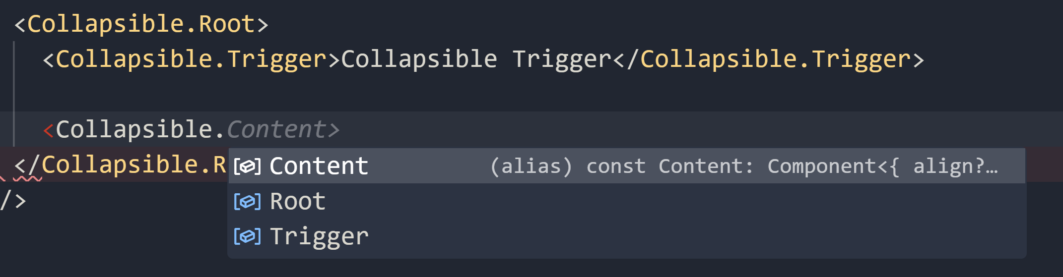
Our goal is to provide the best developer experience. Qwik UI offers fully-typed, discoverable, and composable components.
FAQ
Credits
We believe in a learner's mindset and have drawn inspiration from many projects, learning from their successes and challenges.